To Do This December: Get a New Logo
#TCNJ project#BB&L#Bull Bear & Lion#article#graphic design#writingWritten for the TCNJ Business newspaper, the Bull, Bear & Lion. View of the full December 2018 edition here.
Is there just something in the air? Is it something about the pumpkin spice and falling leaves that make people think “I need to rebrand”? Clubs are recruiting, college students are applying for jobs, and businesses are just slowing down after a long summer. Whatever the reason may be, fall seems to be a great time to rebrand and rethink your logo. Before you dive in, however, you might want to consider what your message is, what tone you want to set, and how your logo is going to be used.
What does it take to rebrand or create a great logo for the first time as a student start-up or small business? Even if you have no idea what you want, the first step is knowing who you are and knowing what you want your logo to convey. A key to this consideration is identifying what makes you stand out from your competitors. In general, determining your market position first is best.
A logo will then set the tone for observers. Its appearance is meant to be catchy and to draw in interested parties before they know anything else about you and your business. In terms of fonts, Comic Sans sets one tone, and Georgia sets a very different one. The same can go for color, clarity of design, and icon usage. This does not mean that a logo has to tell everyone outright who you are. Some of the best logos, like those of Apple and Target, give nothing away about what a company does, yet are the most recognizable aspect of its brand.
Speaking of recognizability, simplicity is key to getting consumers to remember you. Think of all the big social media icons: Instagram, Twitter, Snapchat; the list goes on. One image sticks with anyone who comes in contact with it, so much so that one needs to only display the social logo and a username for the entire web to understand what one is referencing. A simple logo can go far when you want your brand to be instantly remembered.

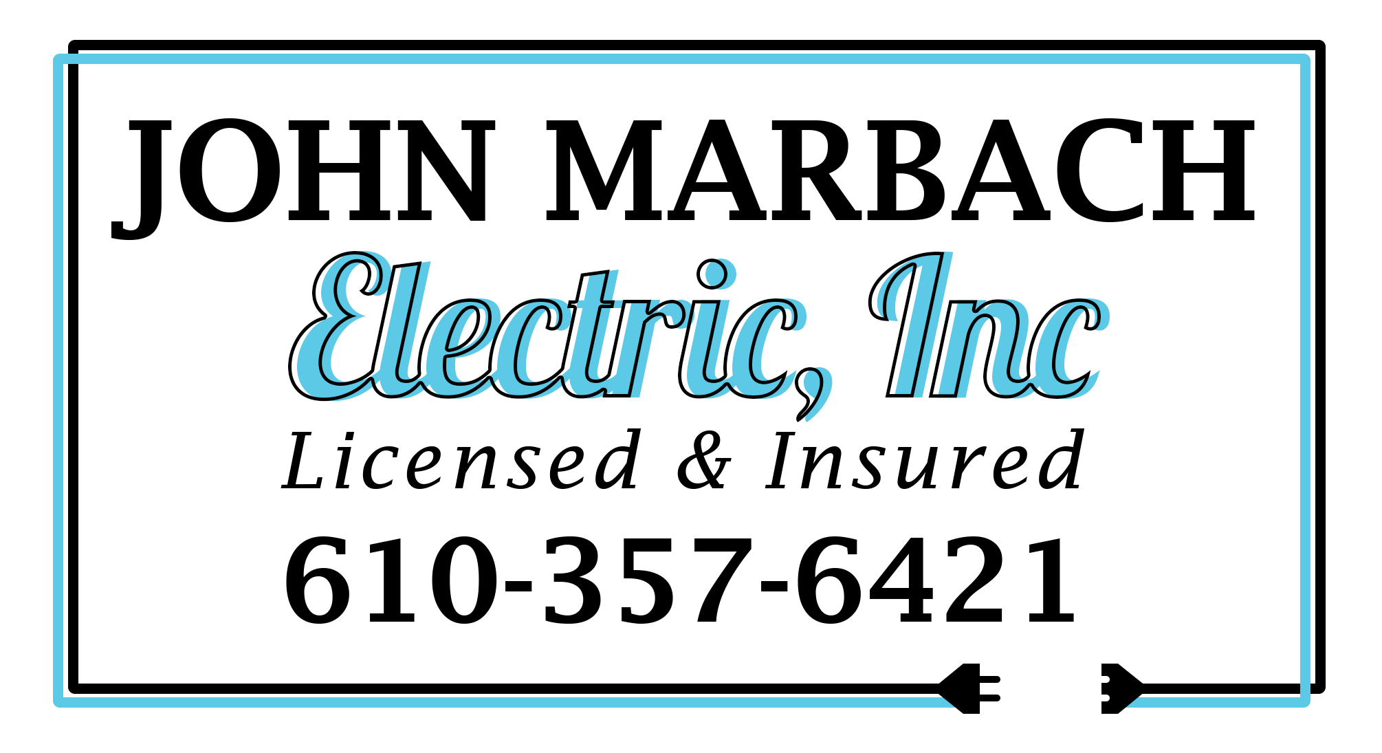
Next up, you should make it a point to consider where this design is going to be used. Logos for t-shirts will look very different than those for website icons. Consider two logos I recently created. One is for an electrician who was looking to rebrand (above). He currently uses his logo as letterhead, on shirts, and on his truck. He needed it to display key information to give potential clients a direct channel to reach out. On the other hand, the “EZ” logo (below) was created for a friend in the tech industry to be used on his website. He can use the simple, versatile design in a number of ways and use its color and style to dictate the look of the rest of the website.
Finally, if you are rebranding with a new logo, consider your roots. How far are you willing to move from your original design? Losing too much of your original concept can be detrimental — if you don’t believe me, look at the change Yahoo! made a few years ago. Key pieces like keeping an icon, a color scheme, or a font are essential to evolving who you are but not losing who you were. When Yahoo! redesigned, its logo lost every one of its original aspects and kept only the company name itself. That being said, rebranding dangers are not as great if you did not have an iconic logo to start out with. The danger of thinking you have nothing to lose in rebranding, however, then comes from making too many changes too fast and appearing disorganized in the process. Constant rebranding also makes committing to promotional materials far more difficult.
Overall, finding a logo for yourself or your business is key to creating a comprehensive brand. It’s a great way to start considering who you are as a business, how you want to be represented, and what should stand out when people look at your brand.